
Swor & Gatto
Role: Senior Designer at Sussner
Logo Redesign
Brand Identity Design
Iconography
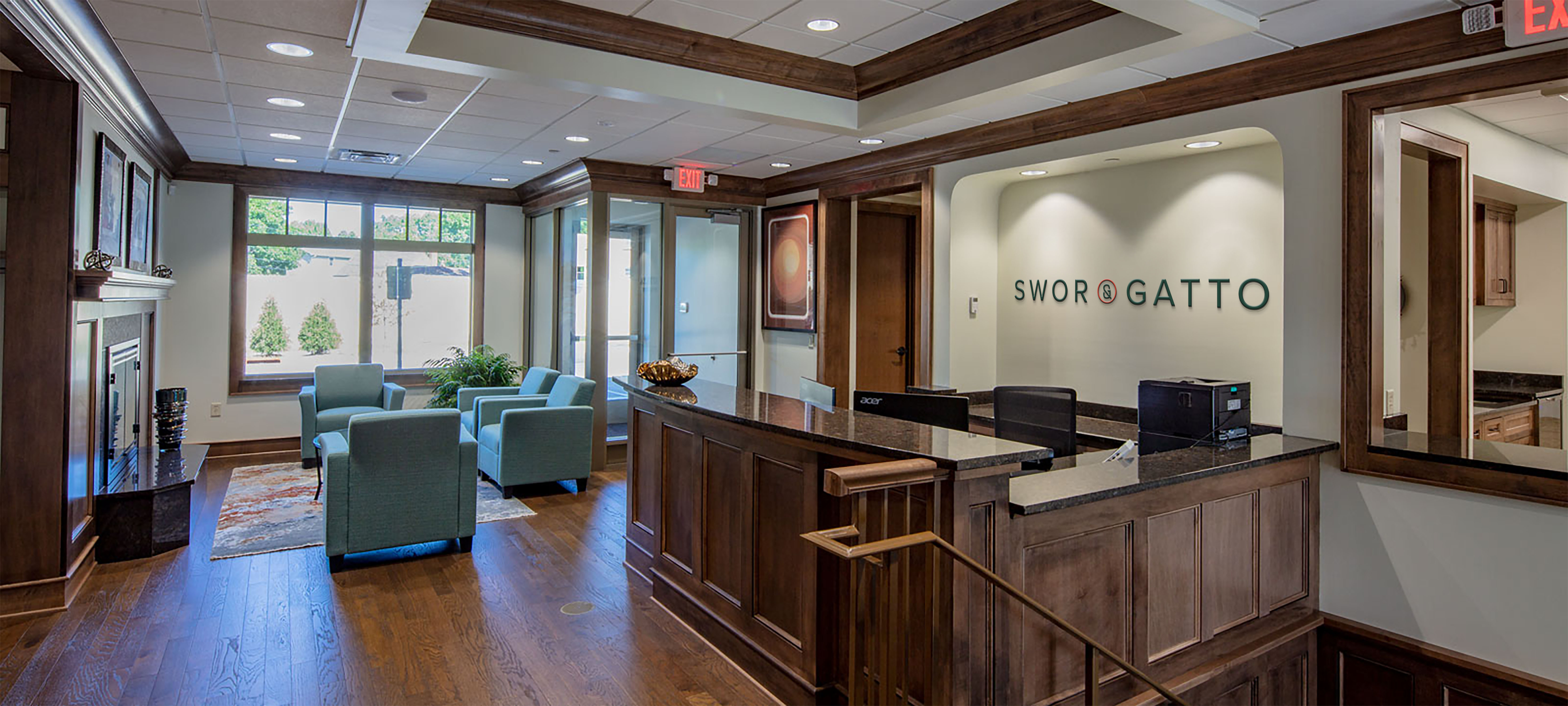
Signage & Application
Location
Twin Cities, MN
The answer was in the name.
During research, I knew we needed to leverage what they had instead of starting over. They're known around Minnesota for their name, and everything else could go. The answer was staring us in the face. The ampersand is what connected the two families, and represents exactly what they do for their clients. The creative direction was built around this idea, and they loved it, so we got right to work. It's the best feeling knowing you have an idea the client believes in before you even put a pencil to paper.

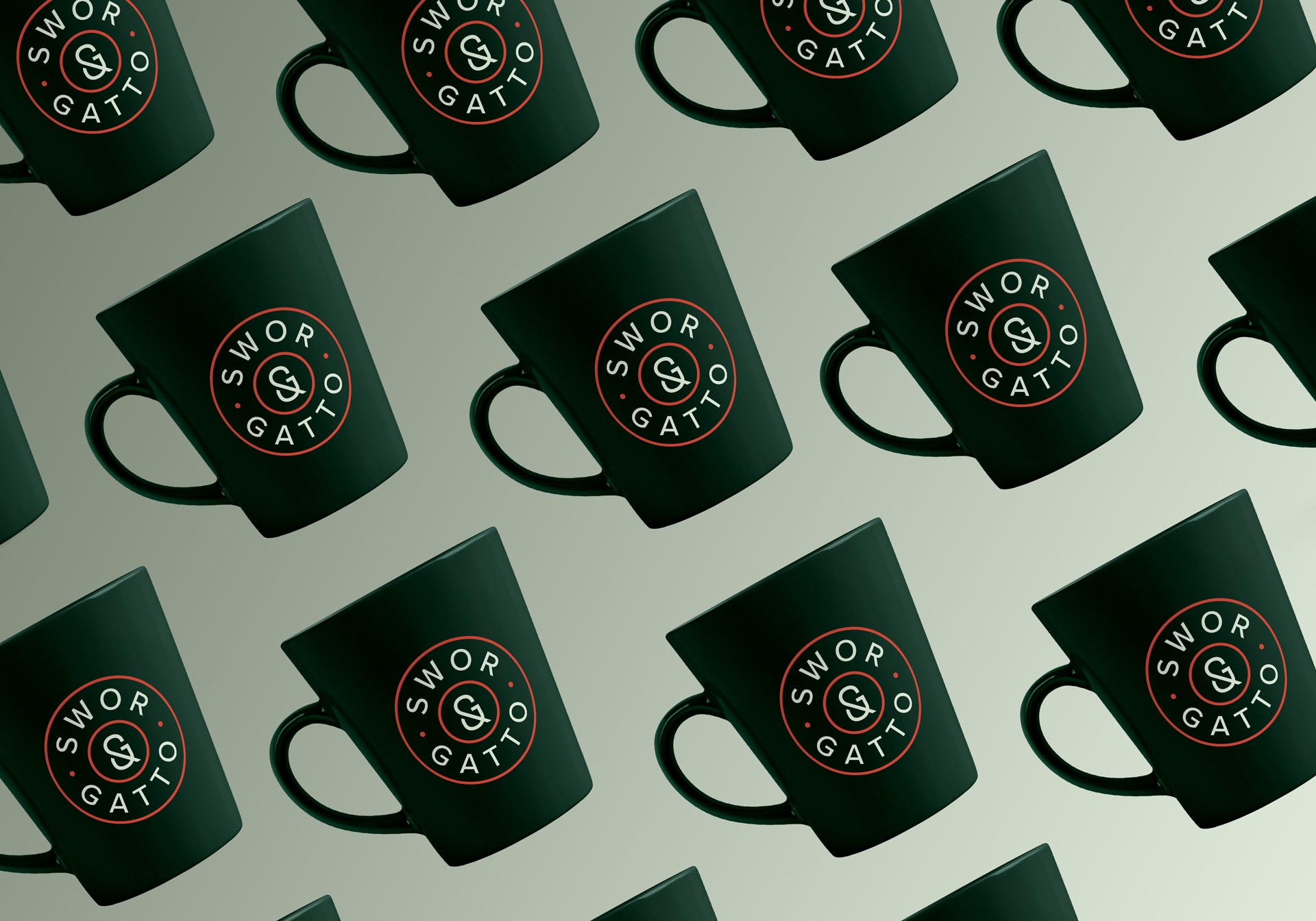
One ampersand to rule them all.
The solution is simple. A monogram that combines an S & G into an ampersand. I'll be honest, though. Getting there wasn't easy. There are about 100 ways you can eat this elephant, & each one pushed us further from the solution. We almost ended up scrapping the idea altogether, until one version finally clicked.

Tough, Smart lawyers.
The ampersand is the anchor, the idea, and the source of truth for anything I built. It runs through the patterns, the icons, the messaging. The verbal identity follows the same pattern. knowledge & determination, access & approachability, family & experience. The brand voice shifted from formal and distant to warm and direct. Confident without being aggressive. Exactly how Marcus and the Gatto family actually talk to their clients.

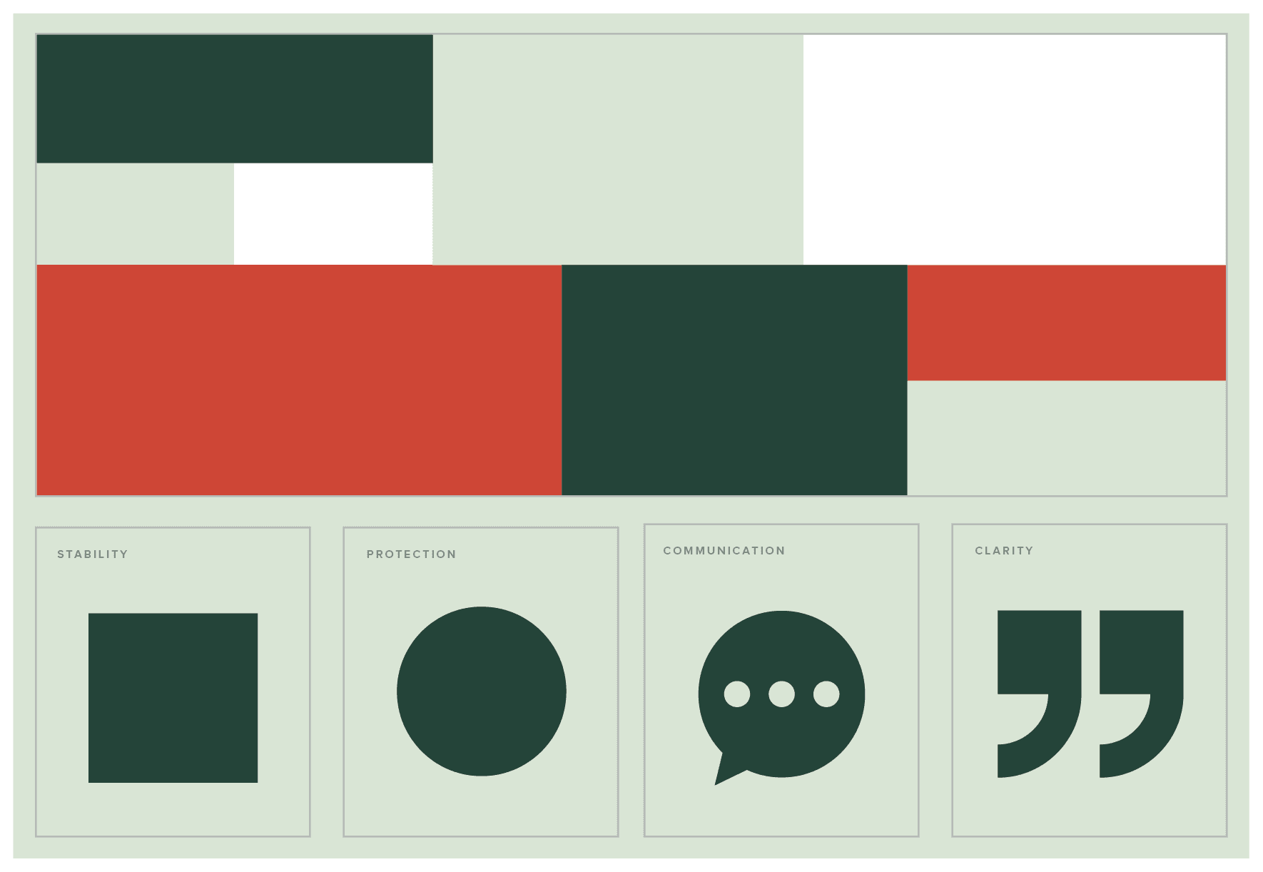

Powerful Icons.
Personal injury clients are not browsing. They are stressed, overwhelmed, & trying to understand a process that feels designed to confuse them. The icons needed to be clear, approachable, & warm enough to not feel clinical. Each one was designed to communicate quickly without adding to the noise. On brand, but built for a person in a hard moment.


& more.
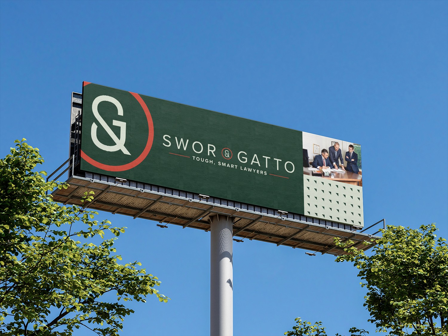
A few weeks after handoff, I was driving down highway 94 in Minneapolis & caught it out of the corner of my eye. The billboard. Full system, deployed, enormous, exactly as designed. It was a jumpscare of impressive implementation. If you live in or around Minneapolis, you may have seen them, too. I was proud, & they were prouder.

A brand now built to help.
More Projects
A focused body of work that spans strategy, identity, and clear direction. Every project starts with an idea worth creating.


