
EnerChange
Role: Senior Designer at Sussner
Brand Identity Refresh
Marketing & Materials
Publication & Reports
Location
Minnesota, US
Putting the Energy in Change
EnerChange needed what it told its customers to do. Change. At Sussner, that's exactly what we helped them achieve.
Their brand had years of brand recognition in the nonprofit space, so starting over wasn't on the table (nor did they need it). The goal was to evolve what existed and give it new life.
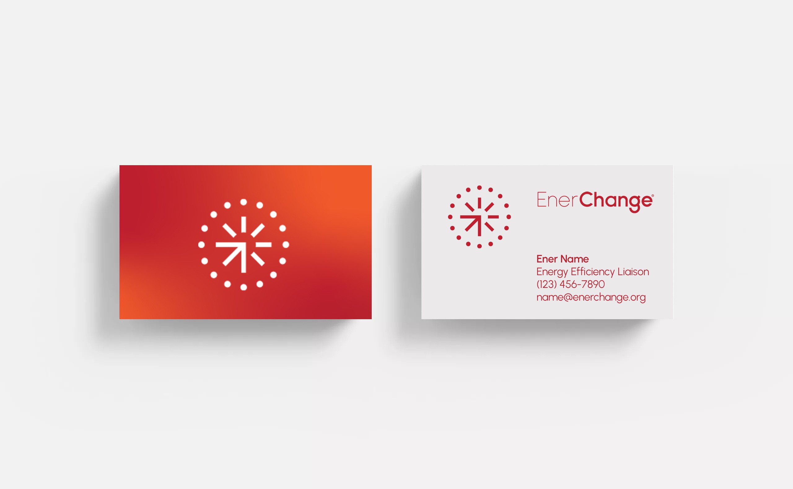
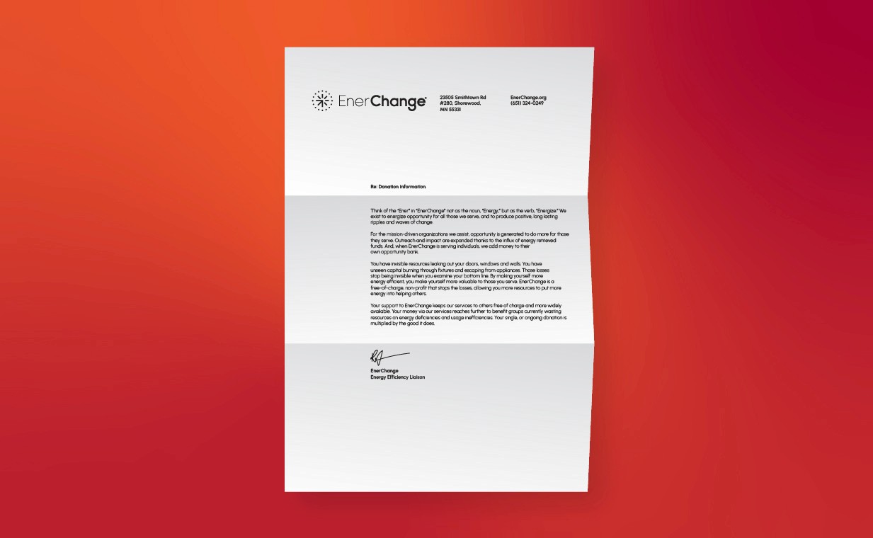
Their previous logo represented the energy created from change. That idea was still there at its core, but it needed a refresh. Their essence is rooted in opportunity, and there's nothing more opportunistic than a new day. The sun became a natural extension of that idea, and a symbol of opportunity, energy, and change. The colors evolved throughout the system rather than the logo, allowing the rest of the brand to do the heavy lifting.
_____
Impact: EnerChange has saved over $30 million dollars in energy costs, and served over 1,200 ongoing organizations.


Complexity is boring (for them)
The brand had generally leaned simple, but geometry became the foundation for everything we created.
From the logo, to the supporting elements, every piece was built to feel simple, clear, and approachable. The upward motion within the mark reinforces the idea of progress and change, while the openness keeps it feeling friendly and accessible.


Turning Energy Into Opportunity
With a clear direction in place, the brand came to life across photography, iconography, and digital experiences.
At its core, the brand is about energizing change. Not just in buildings, but in communities. Turning saved energy into something more meaningful for the people it serves, and the world at large.


Small changes can make a big impact
Working alongside a brand strategist and copywriter at Sussner, the focus was on the real challenges their audience faces. Wasted energy, lost resources, and missed opportunities. We had to flip the script in the customer's mind. To make them think about opportunity instead of waste. Solutions instead of problems, and the impact a small change can make.


More Projects
A focused body of work that spans strategy, identity, and clear direction. Every project starts with an idea worth creating.


