
Mayflower Supply Co.
Brand Strategy
Logo Design
Apparel Design
Location
Saskatoon Saskatchewan, CA
Find your joy.
Mayflower Supply Co. began with a kickoff meeting with founder Madison, who had recently moved to Saskatchewan to start an outdoor clothing brand. She wanted to build a brand for people with a little grit who value quality over quantity.
The name comes from the wildflowers scattered across the prairies around Saskatoon (and not the historic ship), and the mission was simple: Find Your Joy.
The logo is a combination of an M and flower serving a visual simplification for the name. Subtle serifs hint at thorns, giving the symbol a slightly traditional edge that fits the brand’s western character.
Inspired by prairie landscapes.
A deep country sky, brown leather tags, the tan of a vast prairie, and the white cloudy skies. Muted and relevant to the area. The clothing told the story, and the colors were just along for the ride.

No two flowers are the same.
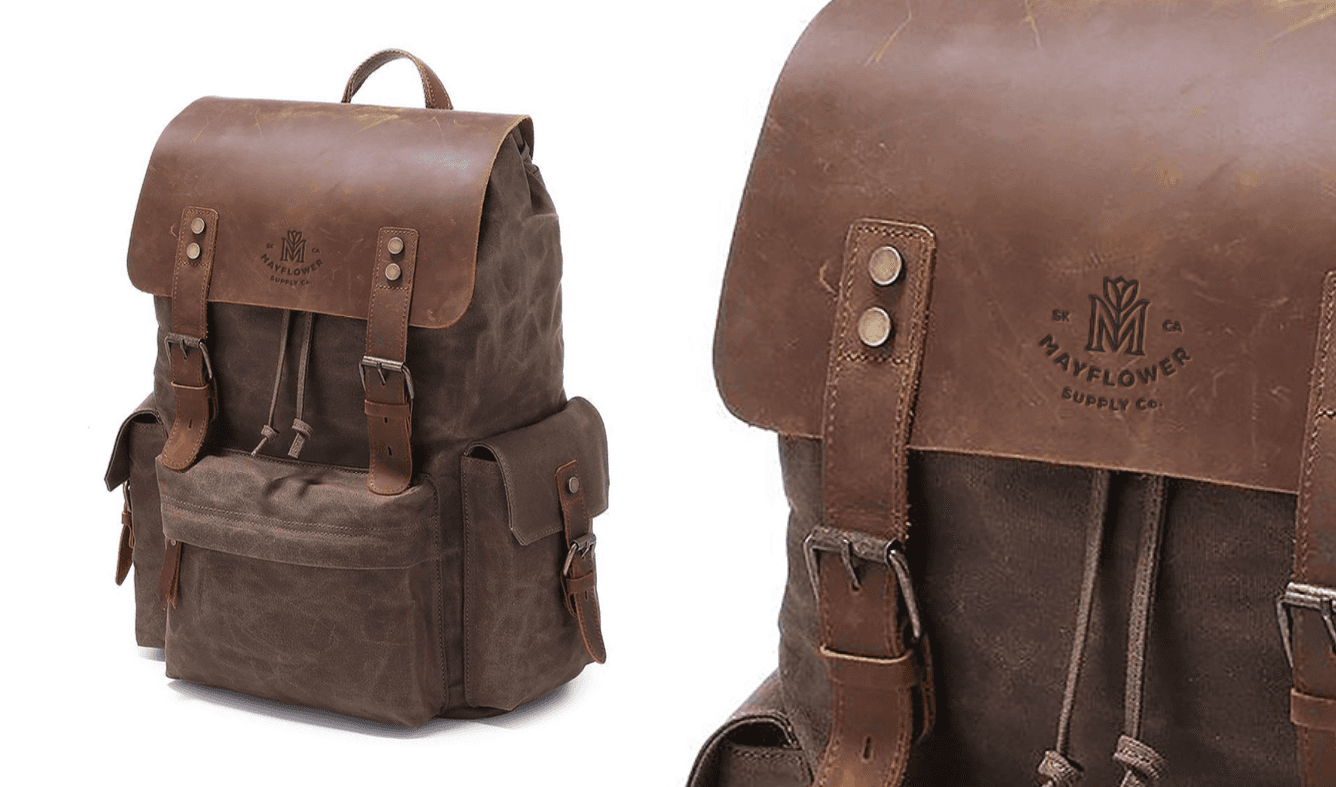
With the symbol established, the next step was creating a flexible labeling system for apparel.
Different garments require different formats — woven patches, interior tags, hats, and small labels. To keep the brand consistent across all of them, I built a responsive system with 18 variations.


More Projects
A focused body of work that spans strategy, identity, and clear direction. Every project starts with an idea worth creating.


